| Author |
Message |
|
Hushi
|
Post subject: Restructuring  Posted: Posted: Thu Jan 16, 2014 1:09 pm |
|
Joined: Thu Sep 20, 2012 10:03 am
Posts: 4
|
Please restructure the Armory without loosing information! It was a nice idea of Smurfas to use the Price to show exact drop location (I also use it lately) so the Sections look much better but I see the Tier 1-3 drops have lost that information now because they have a vendor price also. It would be nice to get back that information somehow. So restructuring is good, loosing info is bad.  edit: Ive found stuff on AoC forums, I will try to add boss names after the price (if it looks ugly I will try to find other solution). 
|
|
  |
|
 |
|
Kentarii
|
Post subject: Re: Restructuring  Posted: Posted: Thu Jan 16, 2014 3:18 pm |
|
 |
| Site Admin |
 |
Joined: Mon Dec 06, 2010 10:38 am
Posts: 87
Location: Oslo, Norway
|
|
Perhaps adding new fields will help, but that means some/a lot of work adding updated info.
|
|
  |
|
 |
|
Smurfas
|
Post subject: Re: Restructuring  Posted: Posted: Tue Feb 04, 2014 3:02 pm |
|
Joined: Wed Jun 27, 2012 6:18 pm
Posts: 5
|
|
Thx.
A new field of info would be nice. It can get annoying to get overview when sets are spreed out over allot of instances/bosses.
Edit: Compare T4 and T3, T3 is nice short and compact, T4 is a very long list and it takes time to find what you are looking for.
Edit2: One other thing some items drop in several locations like the Ardashir sets, some items drop in fort and some in the arena but wrists drops in both locations.
I'm also trying to update picture where I can with high quality versions without that ugly orange background, Character bound text and red text if you cant use the item.
I use png files instead of jpg then i rename the file to jpg to upload, this gives best quality.
|
|
  |
|
 |
|
Kentarii
|
Post subject: Re: Restructuring  Posted: Posted: Tue Feb 04, 2014 7:24 pm |
|
 |
| Site Admin |
 |
Joined: Mon Dec 06, 2010 10:38 am
Posts: 87
Location: Oslo, Norway
|
Smurfas wrote: Thx.
A new field of info would be nice. It can get annoying to get overview when sets are spreed out over allot of instances/bosses.
Edit: Compare T4 and T3, T3 is nice short and compact, T4 is a very long list and it takes time to find what you are looking for.
Do you guys have any examples on where you have used price field to add other info? (Link please) Smurfas wrote: Edit2: One other thing some items drop in several locations like the Ardashir sets, some items drop in fort and some in the arena but wrists drops in both locations.
You can add one item, but link it to different places by adding several nodes. Smurfas wrote: I'm also trying to update picture where I can with high quality versions without that ugly orange background, Character bound text and red text if you cant use the item.
I use png files instead of jpg then i rename the file to jpg to upload, this gives best quality. The reason I went for jpg instead of png was filesize. Didn't really see much improvement with png given the small size of the items anyways.
|
|
  |
|
 |
|
Smurfas
|
Post subject: Re: Restructuring  Posted: Posted: Wed Feb 05, 2014 1:25 am |
|
Joined: Wed Jun 27, 2012 6:18 pm
Posts: 5
|
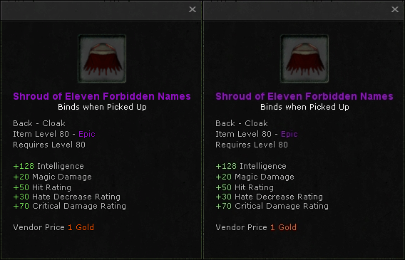
Check "Ardashir Fort" section Yes I know you can have several nodes of the same item, thing is like all raids gear drops but you can also buy it with relics. This makes those lists very long and when you are comparing gear there will be allot of scrolling. It would be nice with a field named drop locations or something so we only need to list items ones. Really you see no difference?  PNG on left and JPG on the right....and the size difference a whopping 13 KB!
|
|
  |
|
 |
|
Kentarii
|
Post subject: Re: Restructuring  Posted: Posted: Thu Feb 06, 2014 10:06 am |
|
 |
| Site Admin |
 |
Joined: Mon Dec 06, 2010 10:38 am
Posts: 87
Location: Oslo, Norway
|
I'll see what I can do about an extra field (no promises on when I will have it ready though). Attachment:
 png-vs-jpg.png [ 16 KiB | Viewed 37886 times ]
Nope... not much difference.
|
|
  |
|
 |
|
Smurfas
|
Post subject: Re: Restructuring  Posted: Posted: Thu Feb 06, 2014 3:54 pm |
|
Joined: Wed Jun 27, 2012 6:18 pm
Posts: 5
|
|
Sounds awesome!
Well not the icons itself but the text/window is a bit nicer, and you have to admit its not that much larger.
What you could do is just make the actual icon the image and the rest around just a window with text, but that means ALLOT of extra fields of info, "Binds when picked up/Equipped"
"Armor Type" "Item Level" "Required Level" "Vendor Price" and maybe misc Info for those items that have procs. But this means ALLOT of work.
|
|
  |
|
 |
|
Kentarii
|
Post subject: Re: Restructuring  Posted: Posted: Thu Feb 06, 2014 8:22 pm |
|
 |
| Site Admin |
 |
Joined: Mon Dec 06, 2010 10:38 am
Posts: 87
Location: Oslo, Norway
|
Smurfas wrote: Sounds awesome!
Well not the icons itself but the text/window is a bit nicer, and you have to admit its not that much larger.
What you could do is just make the actual icon the image and the rest around just a window with text, but that means ALLOT of extra fields of info, "Binds when picked up/Equipped"
"Armor Type" "Item Level" "Required Level" "Vendor Price" and maybe misc Info for those items that have procs. But this means ALLOT of work. If you want to use png, go ahead, I don't mind. Space/speed isn't an issue for me, but for some people on slower connection perhaps. I thought about generating my own image at some point, but that thought quickly faded away, so not gonna do that 
|
|
  |
|
 |
|


